
QotD: Bees
Posted March 11th, 2004 @ 08:28am by Erik J. Barzeski
Question: Which of the following three choices do you like most? Which do you like second?
A) 
B) 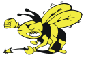
C) 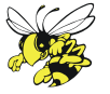
See my previous post as to why I'm asking…
My Answer: I don't know yet. That's partly why I'm asking!
You are encouraged to answer the Question of the Day for yourself in the comments or on your blog.
 Donate Life
Posted 11 Mar 2004 at 8:31am #
B.
Posted 11 Mar 2004 at 8:53am #
C is first, I like the 'cute' factor. Since I'm no where near Georgia it wouldn't matter to me. That said, B's tail/stinger thing is too phallic. While I don't really like A it would have to be my second choice to avoid being ridiculed for having a bee that's chokin' his chicken on my boat.
Posted 11 Mar 2004 at 8:58am #
I like C, but it looks awfully similar to the Georgia Tech mascot. My second choice would be B.
Posted 11 Mar 2004 at 9:05am #
Yeah, it does. The only association I've got with Georgia is that I've been there twice, I hate the Atlanta Braves, I live in a state that touches Georgia, and I really like a girl named Kate (who lives in Georgia), so I'd probably like to avoid associating myself with Georgia Tech.
Posted 11 Mar 2004 at 9:06am #
C. My second choice is B then. the first bee looks like it wants a hug or something… 😉
Posted 11 Mar 2004 at 9:49am #
C
Posted 11 Mar 2004 at 10:27am #
C by a nose over B.
Posted 11 Mar 2004 at 10:43am #
B
Posted 11 Mar 2004 at 10:48am #
I'd vote for C as the best, although B looks more like a "killer".
Posted 11 Mar 2004 at 11:21am #
C looks best to me. I like the white wings, the shape of the eyes, and the smooth abdomen.
It also looks very familiar - indeed, if I were shown that image randomly, I'd ask where it was found!
I don't much like the look of A.
Posted 11 Mar 2004 at 12:15pm #
B would be my choice.
Posted 11 Mar 2004 at 12:36pm #
C, then B.
A is too covered concerning the bee's body, and maybe you could have 'B' turn the head a little ?
Posted 11 Mar 2004 at 1:09pm #
First choice is C, it looks like its going for the kill. B looks meaner, but his stinger looks weak.
Posted 11 Mar 2004 at 4:48pm #
C easily. It's unfortunate that it is so similar to the GATech mascot though
Posted 11 Mar 2004 at 5:31pm #
Just got the email about the change, I would go for C then B.
Posted 11 Mar 2004 at 7:44pm #
I like B, probably due to the sexual subtext.
- Scott
Posted 12 Mar 2004 at 1:08am #
C, although it looks very similar to Georgia Tech's yellowjacket logo. Take a look here.
Posted 12 Mar 2004 at 9:33am #
C, then B
Posted 12 Mar 2004 at 8:23pm #
A and then C. All three have a nice mix of cuteness and attitude, but the eyes in A are the tiebreaker for me. C looks a little too friendly and cutesy (it could be either grinning or grimmacing and it looks like it's wearing cute little shoes). I might move the wings in A up just a sliver so more of the body is visible, so that it is more obvious that it is a bee.
I agree somewhat with the remarks about the subtext in B. Phalic imagery aside, any stinger as limp as the one in B is unlikely to any damage.
B also looks like a disgruntled crotchety guy. It looks like it's shaking the fist in annoyance. I could easily see it yelling "Hey, kids! Get offa my yard!" and then muttering "Darn hoodlums"; or barking, "Hey, learn to drive, moron!"; or even, "You win this time, Superhero Man, but I'll be baaaack!" I almost feel sorry for B.
Who's the artist?
(By the way, your comment preview page still looks sort of like it's from a previous NSLog() design and didn't get updated. You might want to have a look at its template.)
Posted 12 Mar 2004 at 8:26pm #
Oh, and if white is a useable color, I'd be curious to see what changing the yellow parts of the eyes to white in all three of those would do.
Posted 12 Mar 2004 at 8:27pm #
That or I'll just take the "Preview" button away.
Posted 16 Mar 2004 at 8:51am #
They all look more like wasps to me.