
QotD: Coping With Mac OS X’s Font Rendering
Posted January 3rd, 2006 @ 08:14am by Erik J. Barzeski
Question: Do you like Mac OS X's font rendering more, less, or the same as Mac OS 9's? Why or why not?
My Answer: Articles like "Coping With Mac OS X's Font Rendering" irk me. I, along with many, think that the font rendering in Mac OS X is far superior to that of Mac OS 9. In fact, since 10.2.4, I've been quite pleased with it on both a PowerBook and an LCD. I have not used Mac OS X much on a CRT. I will say this: examples like this are a bit contrived - use a larger font if you can't read it or bump up the smallest "smoothable" size.
You are encouraged to answer the Question of the Day for yourself in the comments or on your blog.
 Donate Life
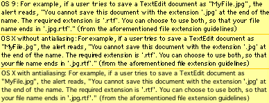
Posted 03 Jan 2006 at 2:10pm #
Erik: I agree that the font rendering--at larger sizes--is far superior to that on Mac OS 9. The smaller type sizes are where things get interesting. (I've been using LCDs for the last few years; I think they're easier to read than CRTs.) I don't want to use larger fonts, because I like to see as much as possible on-screen at once. Bumping up the smoothing threshold doesn't help because OS X doesn't use the proper character shapes or spacing when smoothing is off. Display hardware is improving, yet because of software flaws people are being forced to use larger fonts (and see less) or resort to workarounds like those described in the article.
Posted 03 Jan 2006 at 2:38pm #
I really like Mac OS X's font rendering. Its subpixel antialiasing looks great on my LCDs (Apple 20" and Dell 20") at work. It doesn't look so good on my 15" iMac at home .. so I use the "best for CRT" option on that particular LCD, trading some resolution loss for something which looks better to me.
Of course, in a year or two we'll be able to use LCDs with a very high pixel density, if they can get the resolution independent GUI working. (they really need to get away from those bitmap-based standard widgets, though.. they're really ugly when they scale up.)
Posted 03 Jan 2006 at 4:02pm #
I agree that font rendering of small sizes is not so hot in OS X, but at the same time I don't understand how anyone can cope with fonts being so bloody small. Gimme 12 or more anytime.
Posted 04 Jan 2006 at 8:07am #
I gotta say, I do like Mac OS X's font rendering more than what we saw in Mac OS 9, and heaps more than what we see in Windows XP. My only complaint is the default state for LCD rendering is somewhat muddy -- I always change it to 'Standard - best for CRT.' But I admit, these things depend on personal taste.