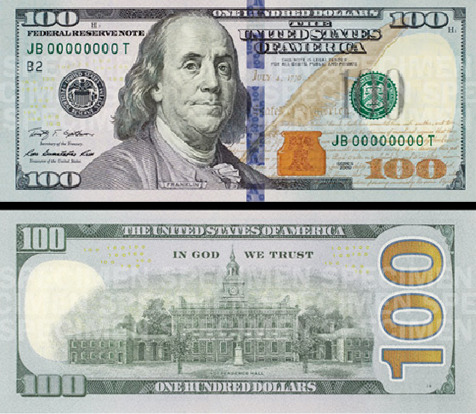
New Money
Posted April 27th, 2010 @ 09:35am by Erik J. Barzeski
I'll pass on this:

But I don't really like this design either (also seen here). Heck, I like the official version more than this redesign.

Posted April 27th, 2010 @ 09:35am by Erik J. Barzeski
I'll pass on this:

But I don't really like this design either (also seen here). Heck, I like the official version more than this redesign.
Posted 13 May 2010 at 1:05pm #
The ones at tyznik.com are horrible, but I like the ones that you show above.
Posted 13 May 2010 at 2:38pm #
The official one's not bad. Except that Franklin's face is inexplicably green (at least in the photos released so far... hopefully it's just inaccurate color balance on the photos). What, is he seasick from traveling to France or something?
And isn't the green supposed to be on the back of a greenback, anyway?
Posted 13 May 2010 at 8:06pm #
why the hate?
Posted 16 May 2010 at 9:06am #
[quote comment="61921"]why the hate?[/quote]
In reality, it's better than what we have now.